Agent Brand Kit
An app that turns a listing into a finished Facebook post. An agent enters their own details once, adds the property photos, and answers a few questions. The app builds the post with their headshot, logos, and contact details.
A listing post takes longer than it should
Agents post the same kind of announcement again and again: a new listing, an open house, a sale. Each one needs the photo, the price, the agent’s name and phone number, and the brokerage logo, all arranged so the post still looks like the agent’s own.
Design templates are fast, but they make every agent look the same. Starting from a blank canvas takes time, and it is easy to forget a detail like the phone number. I wanted a tool that asks the questions a post needs, and then does the layout.
Set up once, then one listing at a time
Your profile, saved on the device
Name, brokerage, phone, email, and website, with a headshot, your logo, and the REALTOR® logo. The details are there the next time you open the app.
Questions, not blank fields
Choose a post type: just listed, open house, or just sold. The app asks the questions that type needs, and the answers fill in the headline and the caption.
Several photos
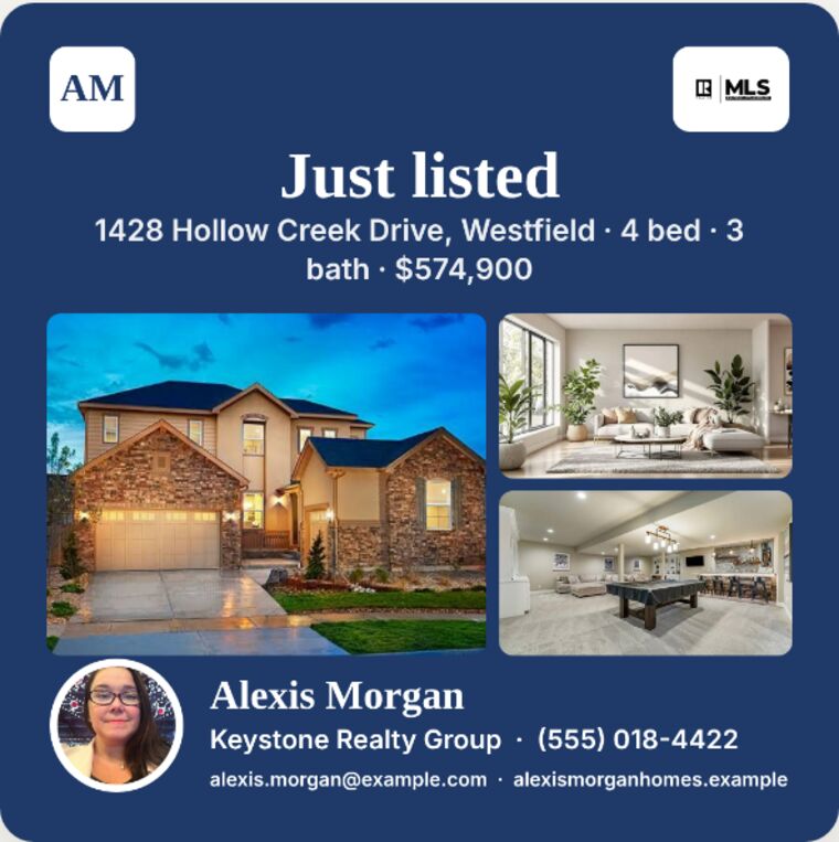
Add up to eight property photos. The main photo leads the post, and the grid layout uses the first four.
Three layouts
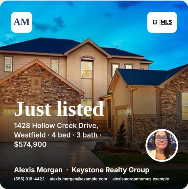
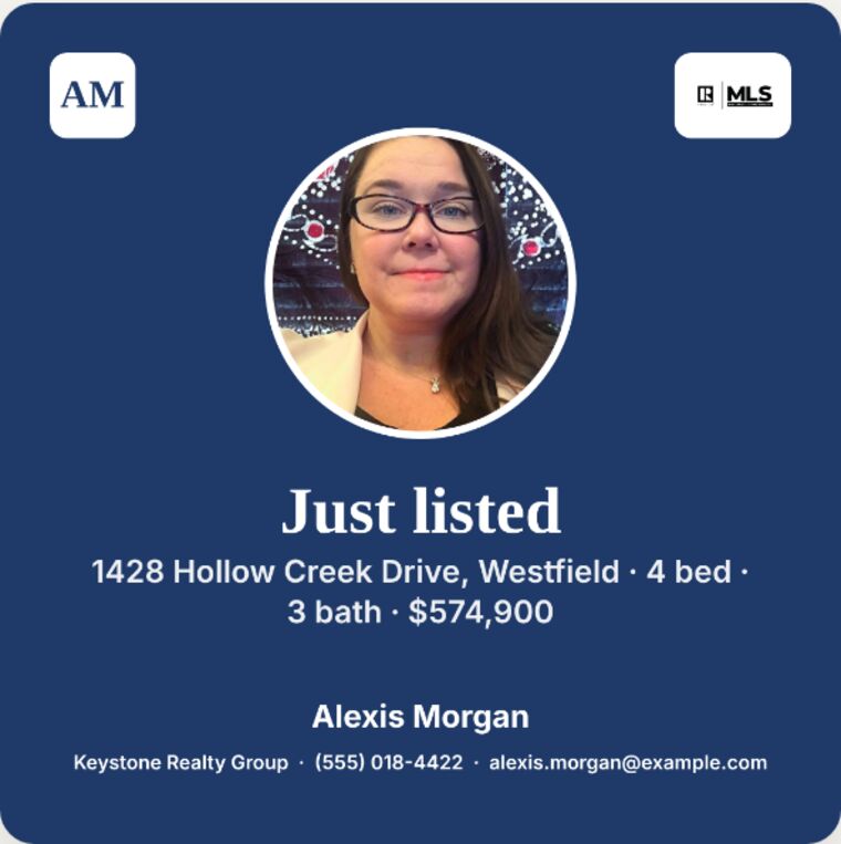
A listing photo that fills the post, a photo grid, or a headshot layout. Each one keeps the same contact details in the same place.
Adjustable framing
Sliders move the photo and the headshot sideways, up or down, and in or out, so the important part stays in the frame.
Edit the words on the image
The headline and the line under it can be changed at any time. A button brings back the text generated from the answers.
What it looks like on the phone
These screenshots come from the working app at phone width, filled with sample details. The agent, property, and people in them are examples, not real listings. Swipe to see them all.


What shaped the screens
Vibe coded in conversation with Claude
I started with a list of what an agent would need on a post, then described each screen in plain language and reviewed it on my phone. Claude wrote most of the code. I made the product calls: which questions come first, how the photos are ordered, and what the agent controls on each post.
I tested each layout at phone width with real-looking sample data. That testing turned up a headshot footer that ran off the image and a contact line that was cut off, and both were fixed before the screenshots were taken.
A working prototype
Everything saves on the device where it is entered, so profiles and photos stay put between visits. Saving a finished image is press and hold on the page, or the copy button where the browser allows it.
- A shared profile that works across devices and with a team, which needs a database
- Full-resolution photo handling for crisp prints and listing sites
- Crop controls for the photo grid, as the listing and headshot layouts have now
- Downloads and sharing buttons that work inside every browser
Need something like this for your business?
I design and build practical tools, and I coach teams to use them with confidence.
Let’s talk