Life Dashboard
One phone screen for the tasks, people, and routines that run a home and a business. Built as a working prototype, then tested on my own days before anyone else sees it.
Life admin is spread across too many places
Appointments live in a calendar. To-dos live in a notes app. Money lives in a spreadsheet. The grocery list is on paper, and the school forms are somewhere in an email. Each tool works on its own, so nothing shows what matters today.
I wanted one screen that answers the question I ask most mornings: what needs me today, and who is waiting on me?
A busy adult running a household and a business
The user is someone who manages a family, a job or business, and a long list of small obligations, and does most of it from a phone. They want to glance at the screen, see the next thing, and put it down.
Each area of life gets its own tile
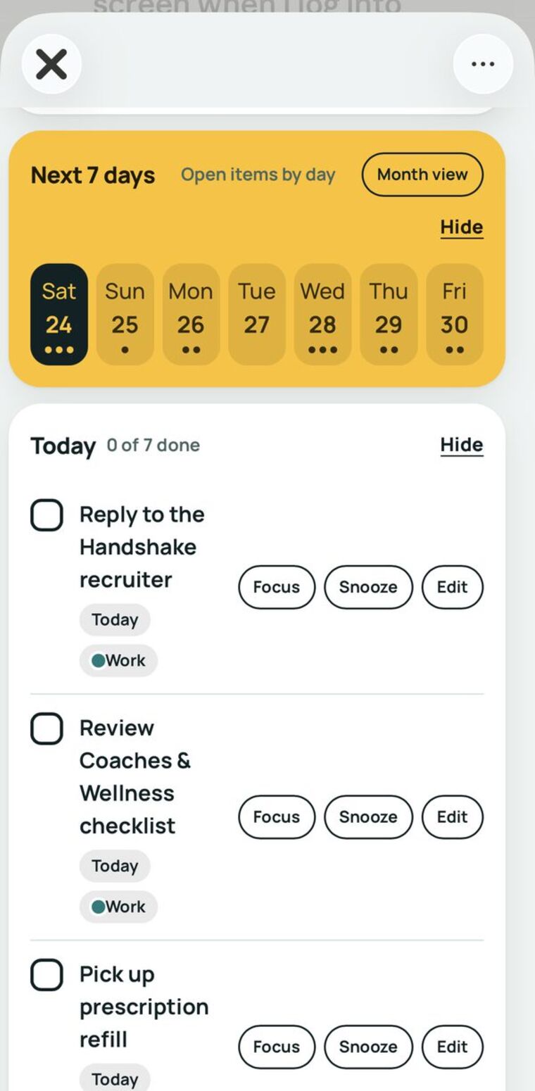
Today and the next seven days
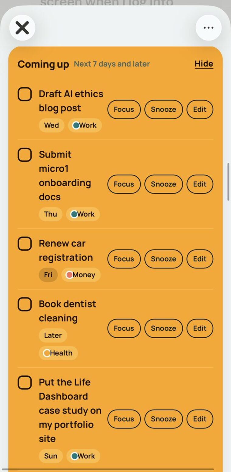
Tasks sorted into Today, Coming up, and Waiting on others. Tap any day to see what is scheduled, or switch to a full month view.
Focus timer
A 25-minute timer started from any task, with a break reminder at the end.
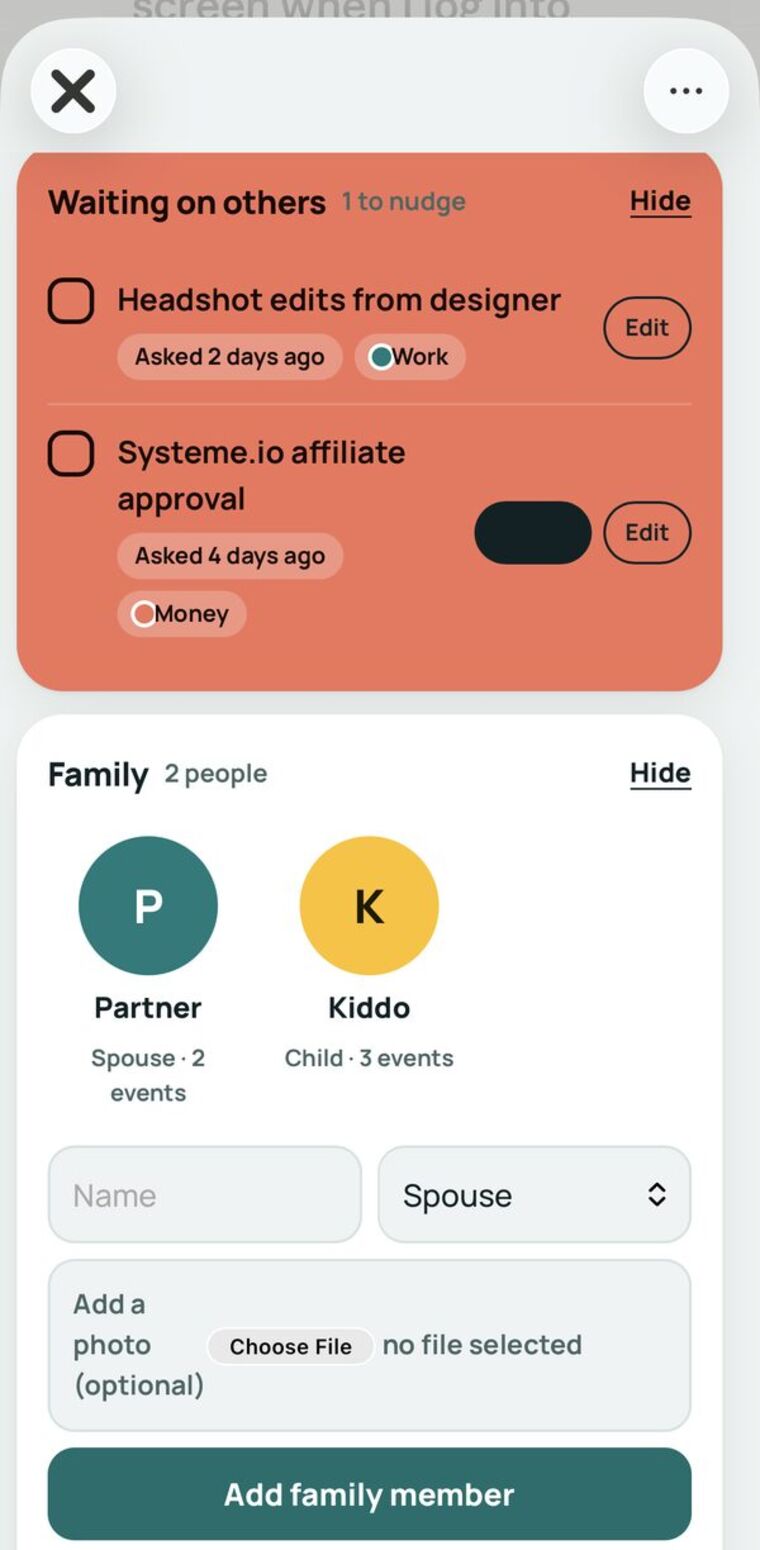
Nudges
Follow-ups that have waited three or more days are flagged so nothing stalls quietly.
Family
Each person has a photo or initials, and tapping them shows their tagged tasks and appointments.
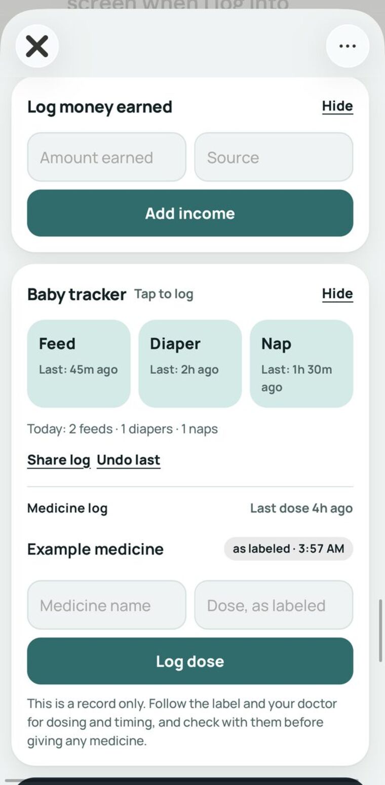
Money
Income and spending by category, with a wheel that shows where the money went.
Productivity
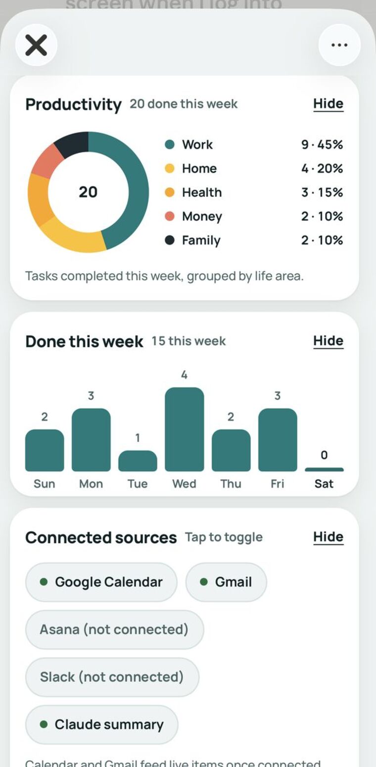
A wheel that shows what got done, broken into life areas.
Habits and water
Daily check-offs with streaks, and a glass counter for the day.
Chores and meals
A weekly chore chart by person, and a meal plan that turns into a grocery list.
Work and movement
A weekly work schedule, a log of exercise, and a sports record.
Look and feel
Pick a background from soft gradients, or use your own photo.
What it looks like on the phone
These are screenshots from my phone, cropped to the app. They show sample data, so no personal details appear. Swipe to see them all.




What shaped the screens
Vibe coded in conversation with Claude
I built the prototype in a series of rounds. Each round, I described what I wanted to see, reviewed the result on screen, and asked for the next change. Claude wrote most of the code. I made the product and design calls, kept what worked, and sent back what didn’t.
The app is one web page with no outside services, so it can be opened on any device and saved to a phone’s home screen. That kept the scope honest: it runs fully without a backend, and anything that needs one is named as a later step.
A working prototype, tested on my own routine
The version here uses sample data so the screens can be explored. I am using it myself before any wider release.
- Lock-screen and home-screen widgets, which need a native phone app
- Connections to calendar and email, so events and follow-ups appear without typing
- Custom dashboards that set themselves up from a short interview
- Shared lists for a partner or family, so more than one person can add to the same plan
Need something like this for your business?
I design and build practical tools, and I coach teams to use them with confidence.
Let’s talk